Light plays a defining role in how colour is perceived inside a home. In Australia, where natural light is often stronger and more directional than in many other parts of the world, wallpaper colours behave differently once installed on the wall.
A wallpaper that looks soft and neutral in one home can feel washed out or overly warm in another, depending on orientation, window size and time of day. Understanding how Australian light interacts with wallpaper colour is essential for achieving interiors that feel balanced, comfortable and intentional.
This guide explains which wallpaper colours work best in Australian light and how to choose them room by room.
Why Australian Light Is Different
Australia’s natural light is typically bright, clear and high in contrast. Many homes receive strong daylight for long periods, particularly those with north or west facing rooms.
This intensity can amplify colours, flatten subtle contrasts or shift undertones more noticeably than softer light conditions. As a result, wallpaper colours need to be chosen with an understanding of how they will react once exposed to real light rather than showroom conditions.
Wallpaper that works beautifully under artificial lighting may appear completely different in a sun-filled Australian home.
Understanding Room Orientation and Light Direction
Room orientation is one of the most important factors when selecting wallpaper colour.
North facing rooms receive consistent, warm light throughout the day. These spaces can handle cooler colours, layered neutrals and darker tones without feeling cold.
South facing rooms receive softer, cooler light. Wallpaper colours in these spaces benefit from warm undertones such as beige, clay or soft taupe to prevent the room from feeling flat or shadowed.
East facing rooms receive gentle morning light, while west facing rooms experience strong afternoon light. Wallpaper colours in these rooms should be chosen with consideration for how they shift from morning to evening.
Neutral Wallpaper Colours That Perform Well
Neutral wallpapers are a popular choice in Australian homes, but not all neutrals behave the same way.
Warm neutrals such as sand, oatmeal, stone and soft beige respond well to bright daylight, maintaining depth without appearing stark. These colours create calm interiors that feel timeless and adaptable.
Cool greys and off-whites can work in well-lit spaces but may appear flat or bluish in rooms with limited natural light. Choosing neutrals with subtle warmth helps maintain balance throughout the day.
Textured or tonal neutral wallpapers add visual interest without relying on strong colour contrast.
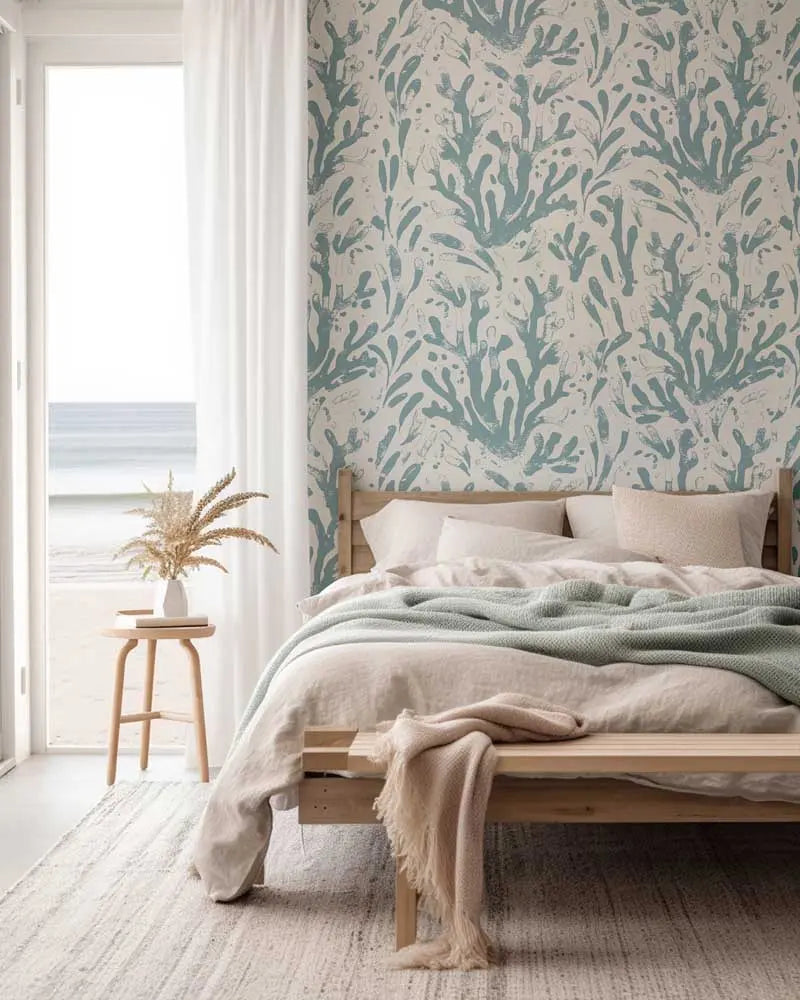
Earthy and Nature Inspired Colours
Earthy colours are particularly well suited to Australian interiors. Greens, terracotta tones, muted browns and clay inspired hues connect naturally with the landscape and respond beautifully to daylight.
Soft greens remain calm in bright light and feel grounding in shaded rooms. Warm terracotta and clay tones glow in afternoon light, adding warmth and character without overwhelming the space.
These colours work well in living rooms, bedrooms and dining areas where a sense of comfort and connection is desired.
Using Dark Wallpaper Colours in Bright Homes
Dark wallpaper colours are often avoided out of fear that they will make a room feel smaller or darker. In Australian homes with strong natural light, darker wallpapers can be surprisingly effective.
Deep blues, charcoal tones and rich greens can create depth and intimacy when balanced with light from windows or skylights. These colours often work best as feature walls rather than full room coverage.
Dark wallpapers tend to perform well in rooms that receive ample daylight, particularly living rooms, bedrooms and powder rooms.
Soft Colours and Pastels in Natural Light
Pastel and soft colour wallpapers can feel fresh and calming in Australian homes when chosen carefully.
Blush tones, muted blues and soft sage greens often look best when they have enough pigment to avoid appearing washed out. Very pale colours can disappear under strong daylight, losing their intended effect.
Using pastels in rooms with controlled or indirect light helps preserve their softness and depth.
Wallpaper Colours for Small and Large Rooms
Room size also influences how colour behaves. In small rooms, lighter colours help maintain a sense of openness, especially when paired with natural light.
In larger rooms, wallpaper colours can be more expressive. Richer tones, layered patterns and murals add scale and visual interest, preventing large walls from feeling empty.
Custom printed wallpaper allows colour intensity and scale to be adjusted to suit the room, ensuring balance regardless of size.
The Role of Pattern and Texture in Colour Perception
Pattern and texture significantly affect how colour is perceived. A flat colour can feel very different once texture or pattern is introduced.
Textured wallpapers soften colour and reduce glare, making them ideal for bright spaces. Patterned wallpapers break up large areas of colour, creating movement and depth that respond well to changing light conditions.
Choosing texture and pattern alongside colour ensures the wallpaper feels intentional rather than overwhelming.
Testing Wallpaper Colours Before Installation
Testing wallpaper in real lighting conditions is essential. Viewing samples at different times of day helps reveal how colours shift between morning, afternoon and evening.
Placing samples near windows, furniture and flooring provides a clearer understanding of how the wallpaper will integrate with the space.
This step is particularly important in Australian homes where light conditions can change dramatically throughout the day.
Material Choice and Light Reflection
Wallpaper material also influences how colour appears. Paste the wall non woven wallpaper tends to have a refined, matte finish that diffuses light evenly. Peel and stick removable wallpaper can have a slightly different surface feel, affecting reflection and depth.
Understanding how material and finish interact with light helps ensure the final result matches expectations.
Choosing Colour with Confidence
Wallpaper colour selection is as much about light as it is about taste. In Australian homes, embracing warm undertones, balanced contrast and thoughtful placement leads to interiors that feel comfortable and cohesive.
When colour, light and design work together, wallpaper enhances the space rather than competing with it.
Kaleon Wallpaper designs and prints custom wallpaper and wall murals in Sydney, Australia, offering both paste the wall non woven wallpaper and peel and stick removable wallpaper tailored to Australian interiors and lighting conditions.


